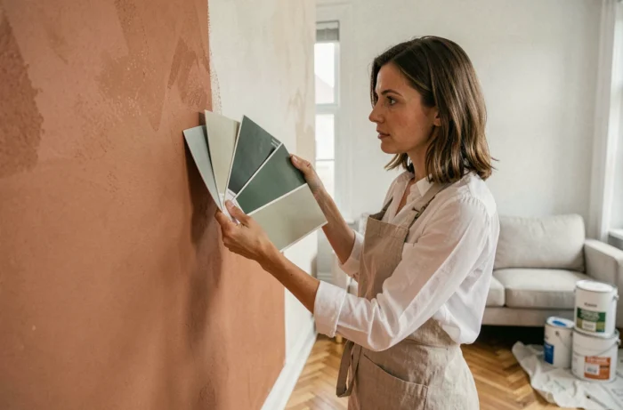
The color temperature of artificial lighting radically changes the perception of a wall painting. An organic green placed under a cool white LED ceiling light turns to a dull gray, while it regains all its depth under a warm-toned source. Before even opening a color chart, we recommend mapping the light sources in the living room, both natural and artificial, as they condition the final rendering of each shade.
Color Temperature and Metamerism: The Parameter That Color Charts Do Not Show
Metamerism refers to the phenomenon where two pigments that appear identical under daylight diverge under artificial lighting. In a north-facing living room, natural light leans towards blue. A warm beige like Bali 2, highlighted by Leroy Merlin for 2026, compensates for this bias and retains its warmth. Conversely, this same beige in a south-facing living room, saturated with direct light, may appear yellowed by late afternoon.
We observe that most color choice errors stem from a test conducted exclusively during the day. The rule: apply a sample on two opposite walls and evaluate it at three distinct times: in the morning with low-angle light, at midday, and in the evening under artificial lighting. A notable difference in perception between these three times indicates a risk of metamerism that must be corrected before ordering the paint pots.
To choose the paint color for the living room, this tripartite test remains the most reliable method, far ahead of digital simulators that do not replicate the actual lighting conditions of the room.
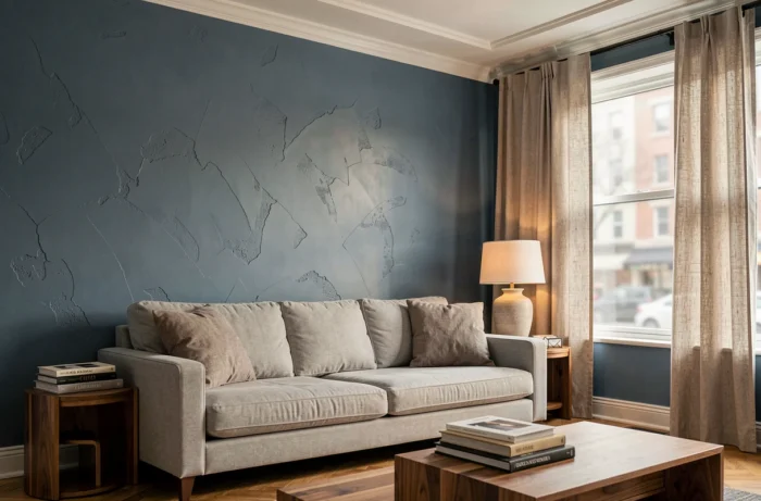
Named Palettes 2026: Grounding the Choice on Dated References
General guides talk about “warm tones” or “cool colors” without ever citing a specific reference. In 2026, manufacturer palettes offer a more operational framework.
- Cloud Dancer (Pantone 2026): a soft off-white, designed as a neutral base for living spaces. It replaces pure white, which appears dull in poorly lit living rooms.
- Bali 2 (Leroy Merlin): a bright natural beige, intended for the main walls of the living room. Its warm undercoat prevents the typical grayish shift of too-cool beiges.
- Coragh Green (Castorama): a deep organic green, suitable for an accent wall. Its intensity contrasts well with a neutral base like Cloud Dancer.
- Deep Indigo Blue: recommended as a focal wall in spacious living rooms where the ceiling height exceeds average, as saturated shades absorb light and visually bring walls closer together.
Working from named references allows for ordering precise samples and avoids back-and-forth trips to the store. It is also the only way to ensure reproducibility if a touch-up is needed a few months later.
Finish and Paint Color in the Living Room: An Underestimated Interaction
The finish alters the perceived color as much as the hue itself. A matte finish absorbs light and darkens the shade by half a tone to a full tone. A satin finish warms it by reflecting part of the ambient light spectrum. A glossy finish amplifies saturation but reveals every flaw in the wall’s flatness.
For a living room, a velvety finish offers the best compromise. It retains the depth of a matte while facilitating maintenance, a crucial criterion in a high-traffic living space. We recommend testing the same shade in two different finishes before making a decision, as the visual difference can be surprising.
Finish-Light Interaction According to Orientation
An east-facing living room receives direct, cool morning light. On a matte organic green wall, this light deepens shadows and gives a darker rendering than expected. A satin finish on this same wall redistributes light and preserves the pigment’s vibrancy. Conversely, a west-facing living room bathed in warm light at the end of the day tolerates a matte finish very well, as the amber light compensates for absorption.

60-30-10 Rule Adapted to Living Room Volumes
The 60-30-10 distribution remains a useful guideline: the dominant color covers most of the walls, the secondary dresses one wall or the main furniture, and the accent shade punctuates with touches (cushions, frames, lighting). However, this rule must be adjusted according to the actual proportions of the room.
In a long living room, painting the back wall in the secondary (more intense) shade visually shortens the perspective. In a square living room with a good ceiling height, extending the secondary color onto the ceiling creates a cocoon effect without overwhelming the volume. Conversely, a low-ceiling living room benefits from keeping the ceiling in an off-white like Cloud Dancer to preserve the sense of height.
Common Mistake on the Accent Wall
Placing the accent wall behind the sofa, thus invisible from the main seating area, reduces its impact to almost nothing. We recommend positioning the strong color on the wall that is visible when entering the room or from the sofa. This wall anchors the perceived ambiance on a daily basis.
Decline of Anthracite Grays and Pure Whites: What This Changes in Practice
The 2026 trends document a clear decline in anthracite gray and bright white in favor of warm neutrals with earthy undertones. This shift has a direct technical consequence: the new warm neutral bases are more sensitive to the yellow pigments of cheap LED lighting. A narrow-spectrum LED ceiling light accentuates the yellow shift of a warm beige, where pure white would have masked it.
The solution lies in lighting with a high color rendering index (CRI). A CRI above 90 faithfully reproduces the undertones of the paint, whether they are pinkish, golden, or greenish. Investing in quality light sources protects the color choice over time and avoids the classic disappointment of “this is not the color I chose in the store.”
The living room remains the space where wall color interacts most with furniture, textiles, and light. Testing on-site, under real lighting, with the furniture in place, remains the only method that secures the final result. The named palettes of 2026 simplify the pre-selection, but nothing replaces the test on the wall.