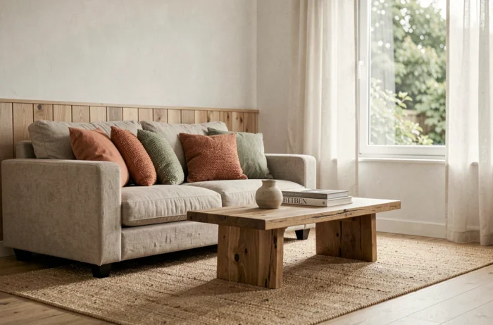
Arranging a house is no longer just about choosing a sofa and a wall color. Recent regulatory constraints on energy renovation require a rethink of the technical layout of rooms, while the palettes and materials that have dominated for the past two years are redefining what we mean by indoor comfort. Here, we address the points that general public guides often overlook.
Integrating energy renovation equipment into interior design
The location of a heat pump, a thermodynamic water heater, or a dual-flow ventilation system is not a detail to be settled after decoration. It is a structuring parameter of the layout plan, just like the position of the kitchen or the size of the living room.
Since the recent focus of CEE aids on large-scale renovation, every design project must align with a comprehensive renovation strategy to remain eligible for funding. Isolated works (such as window replacement or spot insulation) are no longer sufficient to trigger significant aid. Specifically, if you plan to redistribute rooms or create an extension, we recommend planning for the necessary technical volumes from the outset: ventilation ducts, space for the indoor unit of the heat pump, hydraulic circuit.
For large-scale renovations, the installation or maintenance of a heating system using fossil fuels is now prohibited, including hybrid heat pumps. This means that the technical room or closet initially intended for a gas boiler can be converted into storage, a pantry, or a laundry room, provided that the passage for the networks of the new heating solution is anticipated. The layout of the house on the Habitat Expo site illustrates this convergence between energy choices and the design of living spaces.
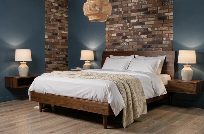
Material and color palette for decorating a living room in 2026
Earthy tones and dark matte woods dominate current palettes. Eggplant, tobacco brown, and lime finishes are making a comeback in interior decoration projects, driven by a desire for visual warmth that the off-whites and pearl grays of previous years do not provide.
We are observing a shift towards raw materials left exposed. Natural stone wall cladding, tinted polished concrete, and thickly applied lime plasters create a tactile relief that flat paint cannot reproduce. This approach works particularly well in the living room and dining area, where large wall surfaces benefit from the depth of texture.
Combining furniture and materials in the living space
Dark wood furniture (walnut, smoked oak) contrasts well with a light-coated wall or a limestone floor. A common mistake is to accumulate dark tones on all surfaces, which overwhelms natural light in north or east-facing rooms.
Here are a few principles we systematically apply:
- Limit dark materials to a maximum of two surfaces per room (for example, floor and one wall), with the rest in light or neutral shades to preserve brightness.
- Favor matte finishes on furniture and walls, reserving satin for woodwork and kitchen elements to create a subtle play of reflections.
- Test the chosen color by applying a sample of at least 50 x 50 cm on the relevant wall, observed at different times of the day, as evening artificial light radically alters the perception of a tobacco brown or eggplant.
Circulation and measuring spaces: the key to successful layout
A circulation corridor less than 80 cm between two pieces of furniture turns any living room into an obstacle course. The functional dimension of the space takes precedence over the amount of furniture. We recommend marking the footprint of each piece of furniture on the floor (using masking tape) before purchase, incorporating the areas for door and drawer openings.
In an open kitchen adjacent to the living room, the question of visual separation without physical partitioning almost always arises. A central island fulfills this function as long as its depth does not reduce the passage to below 90 cm on the circulation side. Beyond the dimension, it is the height of the countertop that determines the degree of separation: a standard-height countertop (about 90 cm) allows the gaze to pass through, while a raised bar obscures the cooking area and preparations.
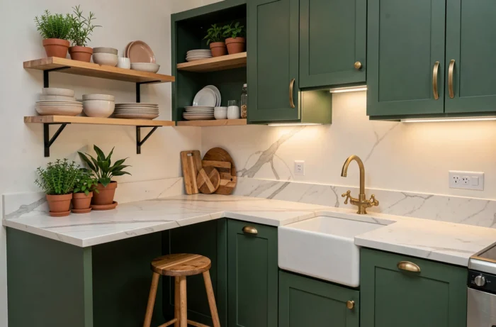
Optimizing square meters in small rooms
The bathroom and entrance are the two areas where over-furnishing causes the most inconvenience. In a small bathroom, a wall-mounted vanity frees up the floor and facilitates cleaning while providing equivalent storage volume to a freestanding unit. Full-width mirrors above the vanity double the perception of depth.
For the entrance, a bench with integrated storage effectively replaces the trio of coat rack-shelf-shoe cabinet. It reduces visual clutter and enforces a single drop-off point, which naturally disciplines daily storage.
Natural light and artificial lighting: prioritizing sources
Multiplying light points remains a relevant piece of advice, but it often lacks hierarchy. Three levels of lighting are sufficient in each room: general lighting (ceiling light or pendant), functional lighting (reading lamp, under-cabinet spots in the kitchen), and ambient lighting (table lamp, indirect LED strip).
A common mistake in the living room is to install a powerful central ceiling light as the sole source. Zenithal light flattens volumes and creates harsh shadows under furniture. We prefer a dimmed ceiling light coupled with two or three side sources (wall sconces, floor lamp) that shape the space and allow for varying atmospheres throughout the day.
- In the kitchen, recessed spots under the upper cabinets illuminate the countertop without glare, with a recommended color temperature around 3,000 K for a natural food rendering.
- In the bedroom, avoid any direct lighting above the bed: favor adjustable reading lights mounted on the wall or at the head of the bed.
- In the bathroom, mirror lighting should be positioned on either side (not above) to avoid shadows on the face.
The comfort of a home relies less on the sum of objects installed than on the coherence between technical choices, materials, and light management. A layout plan that integrates energy constraints and circulation flows from the outset avoids costly revisions and produces an interior that functions daily, not just in photos.