
The beige suit belongs to the family of warm neutral tones. Its uniqueness, in terms of pairing, lies in its low saturation and high brightness: it reflects light more than a navy or charcoal suit. The tie worn over it must therefore work with this light base without creating a harsh contrast or blending in to the point of disappearing.
Color Temperature and Undertone of Beige: The Technical Basis
Not all beiges are created equal. A beige suit leaning towards yellow (sand, camel) does not call for the same ties as a pinkish or grayish beige. Before choosing anything, turn the jacket under natural light and identify the dominant undertone: yellow, pink, or gray.
A yellow-golden undertone pairs well with ties in warm tones (rust, cognac, deep burgundy). A pinkish undertone tolerates cooler blues and garnet better. A grayish beige, rarer, accepts desaturated shades like olive or taupe. Matching the tie to the suit’s undertone avoids the “clashing colors” effect that most guides forget to mention by limiting themselves to generic recommendations.
To delve deeper into this matching logic between beige and tie colors, you can consult the Absolutis website for the right choice of shade for your suit.
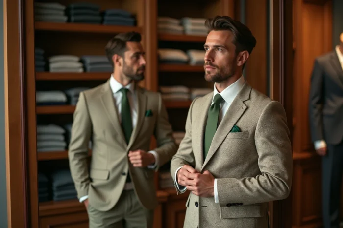
Tie and Beige Suit: Combinations That Work by Season
The beige suit is a warm-weather garment in the classic wardrobe, but the earth tones trend that emerged in 2024 has established it year-round. Tie combinations vary according to the seasonal context and the fabric of the suit.
Spring and Summer: Favor Visual Lightness
On a linen or lightweight cotton suit, a matte silk or linen tie avoids a texture mismatch. The colors that stand out best are sky blue, soft terracotta, and sage green. These shades respect the warmth of beige without weighing down the outfit.
- Sky blue or powder blue on a white shirt: the contrast remains readable without being aggressive, suitable for an outdoor wedding or a summer professional event.
- Muted terracotta or rust on a cream shirt: a tone-on-tone combination that plays on nuances rather than opposition, very coherent with the current earth tones palette.
- Sage green or light olive on a sky blue shirt: a tricolor match that implies a certain confidence, but works particularly well with a beige with a yellow undertone.
Autumn and Winter: Increase Density
When the beige suit is made from a denser fabric (flannel, gabardine), the tie can also gain visual weight. Matte finishes, wool knits, or textured silk integrate better than shiny silk, which would create an annoying material contrast.
Deep burgundy, chocolate brown, and cognac are safe bets. A matte silk burgundy tie is the most versatile option for a beige suit worn from October to March: it works with a white shirt as well as with a light blue shirt.
Tie Patterns on a Beige Suit: Proportion Rules
The beige suit is almost always solid or very subtly textured. This leaves room for patterns on the tie, provided a simple rule is followed: the size of the pattern must remain proportional to the width of the tie.
On a standard width tie, small regular patterns (fine dots, micro-stripes, small diamonds) pass without difficulty. Club stripes (wide diagonals) also work, but require the shirt to be solid to avoid visual overload.
Cashmere patterns (paisley) are riskier. Their graphic density can overwhelm a light beige ensemble. If you insist on a paisley, choose it in shades close to the suit (brown, gold, rust) rather than in a contrasting color.
A common mistake is to wear a striped tie with a striped shirt on a beige suit. Even if the stripes differ in size, two overlapping linear patterns create visual noise that beige, neutral by nature, does not absorb.
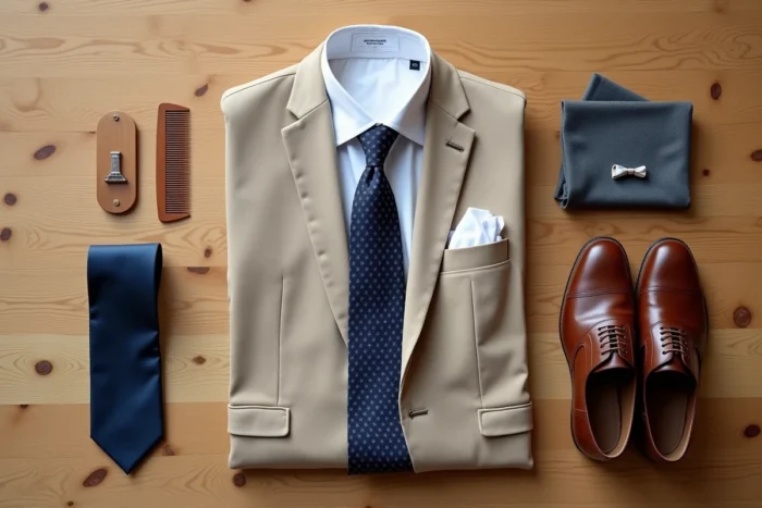
Pocket Square, Shirt, and Collar: The Details That Lock It All Together
The tie does not exist in isolation. On a beige suit, the shirt plays a binding role between the jacket and the accessory.
The white shirt remains the most readable choice. It clearly separates the beige of the suit from the color of the tie, making it easier to read the outfit. The sky blue shirt works almost as well, provided the tie is not blue itself (the contrast disappears).
The pocket square, if you wear one, should never match the tie exactly. A color reminder is sufficient. On a beige suit with a burgundy tie, a pocket square in off-white or cream creates a subtle balance. A matching burgundy pocket square would give too coordinated an effect, almost stage costume.
- Italian or semi-cutaway collar: suitable for standard width ties, it allows the knot to breathe and highlights the chosen color.
- Button-down collar: to be reserved for casual outfits, it reduces the visual impact of the tie and is better suited to knit or linen textures.
- Classic straight collar: neutral, it works everywhere but does not particularly highlight the tie on a beige ensemble.
The choice of collar directly influences the size of the visible knot, and thus the proportion of color that the tie brings to the whole. On a beige base, where the suit imposes little contrast by itself, the tie knot becomes the main focal point of the outfit.
A well-matched beige suit relies on three decisions made in the right order: identifying the undertone of the fabric, selecting the tie based on this undertone and the season, and then adjusting the shirt and pocket square so that the whole remains coherent without appearing overly calculated. The margin for error is smaller than with a dark suit, but successful combinations have a clear advantage: they stand out.