When you open your wardrobe in June, the first instinct is rarely to consult a Pantone color chart. You grab a light jean, a white top, and improvise. The problem is that the colors and patterns for summer 2026 no longer work like previous seasons: the logic of “all pastels” or “all flashy” has given way to a more precise play of contrasts between a neutral base and a bold touch of color.
Neutral base and theatrical accent: the true color code for summer 2026
We start from a concrete situation. You have a cream dress, off-white pants, or beige sand shorts. Until now, these pieces served as a “background” without personality. This season, they become the centerpiece.
The choice of Cloud Dancer white as the reference color for 2026 marks a turning point. For the first time, a pure white achieves the status of a key shade, worn as a statement rather than a default neutral. We are talking about visual sobriety as a stylistic choice, not bland minimalism.
The principle is simple: a look composed of 80% soothing neutrals (off-white, angora, sage green, cocoa brown) receives a single piece or accessory in a bold color, as detailed in the summer trends on Kabanes with concrete associations by morphology and occasion.
In practice, this results in cream wide-leg pants with a bright orange bag. Or an off-white oversized shirt tucked into a sage green skirt, elevated by fuchsia earrings. One intense color point is enough to structure the outfit.
Summer colors to prioritize according to the type of piece
Not all trendy colors work on every garment. You don’t wear a mandarin orange the same way on a long dress and on a basic t-shirt. The choice of the piece dictates the result.
Structured pieces: daring warm shades
On a linen blazer, a light jacket, or a fitted jumpsuit, warm shades like terracotta, pale yellow, or powder pink take on their full volume. The rigid cut gives structure to these colors, which might appear dull on a fluid fabric.
Denim remains the natural partner for these pieces. A light jean paired with a terracotta blazer creates a summer look that works just as well on a terrace as in the office.
Fluid pieces: betting on luminous neutrals
Midi dresses, pleated skirts, draped tops: these silhouettes benefit from staying within the range of whites, creams, and beiges. The fluidity of the fabric does the visual work. Adding a bright color to a very soft material often produces a “costume” effect rather than a fashion effect.
Opinions vary on this point, but sage green stands out as an exception. Its moderate depth allows it to work well on both a fluid dress and cargo pants.
Summer 2026 patterns: vichy, graphic floral, and resort print
On the pattern front, the season is not limited to the eternal tropicals. Three clear directions emerge and deserve attention.
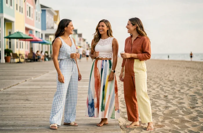
- The romantic vichy is making a strong comeback, not in its picnic tablecloth version but in enlarged proportions, on midi dresses or oversized shirts. The checks are often rendered in powder pink on a white background or sky blue on cream.
- The graphic floral replaces the realistic floral. We are no longer seeking a faithful reproduction of a bouquet but rather stylized, almost abstract shapes printed in solid colors on neutral backgrounds.
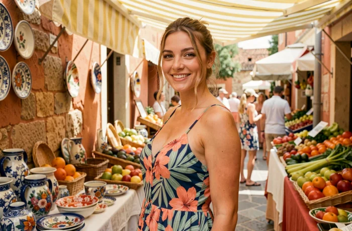
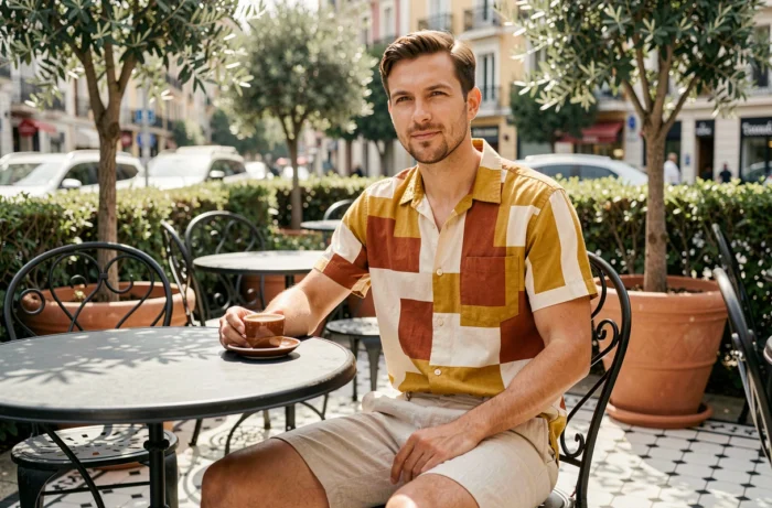
- The resort print (wide stripes, geometric patterns inspired by Mediterranean ceramics) is establishing itself beyond the beach wardrobe. It can be found on wide pants and coordinated sets suitable for the city.
The common thread among these three families of patterns: they fit into the logic of the neutral background mentioned earlier. A pink vichy on white does not “shout.” It adds visual rhythm without breaking the coherence of a sober outfit.
Combining colors and patterns without overloading the look
The most reliable operational rule for this summer can be summed up in one sentence: one pattern per outfit, one strong color per outfit. The two do not combine in the same look, unless the pattern already contains the strong color (a fuchsia vichy on white, for example).
In practical terms, here’s how to decide:
- If the centerpiece is a print (vichy dress, floral shirt), the rest of the look remains solid and neutral: raw denim, beige sandals, white bag.
- If the centerpiece is a bold solid color (orange top, pale yellow skirt), avoid any pattern elsewhere. Accessories should remain in natural tones.
- Textured materials (crumpled linen, crochet, English embroidery) count as a “visual pattern.” Treat them as such in the outfit composition.
This approach aligns with the quiet luxury trend applied to summer colors. Discreet luxury does not mean the absence of color; it means precision in dosage. One strong decision per look, embraced and visible.
Accessories: the underestimated lever
When hesitant to wear a bright color in clothing, an accessory offers a low-risk testing ground. An orange mandarin leather bag, a pair of millennial pink mules, or colorful-framed glasses are enough to anchor the summer palette without overhauling the entire wardrobe.
Gold jewelry remains the most versatile common thread between neutral shades and touches of color. They visually connect an off-white top to a vibrant accessory without creating a break.
The summer wardrobe for 2026 does not require a complete overhaul. Two or three quality neutral pieces, a well-chosen pattern, and a colorful accessory are enough to create outfits that hold up from June to September.